Whether you’re rebranding your SaaS website or you’re building a brand new website for your SaaS startup, you’ve got two choices:
Assuming you’re somewhat level-headed (and we know you are because you read our posts), I’m going to assume you’re in the “use what works” camp regarding good web design.
But when it comes to SaaS web design, what really works?
As the saying goes, “success leaves clues,” and who could be more successful than the 3 top SaaS companies in Australia today?
The following SaaS brands spend several thousand dollars on web design and development to engage their visitors, strengthen their brand, and get people to take action once they visit their website.
They must be doing something right.
But what?
Let’s take a look.
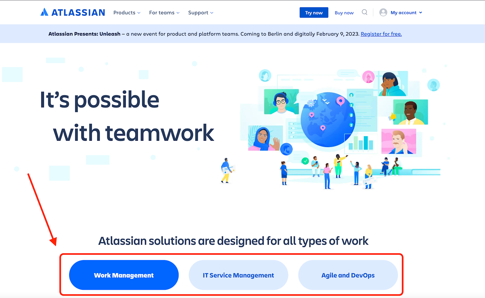
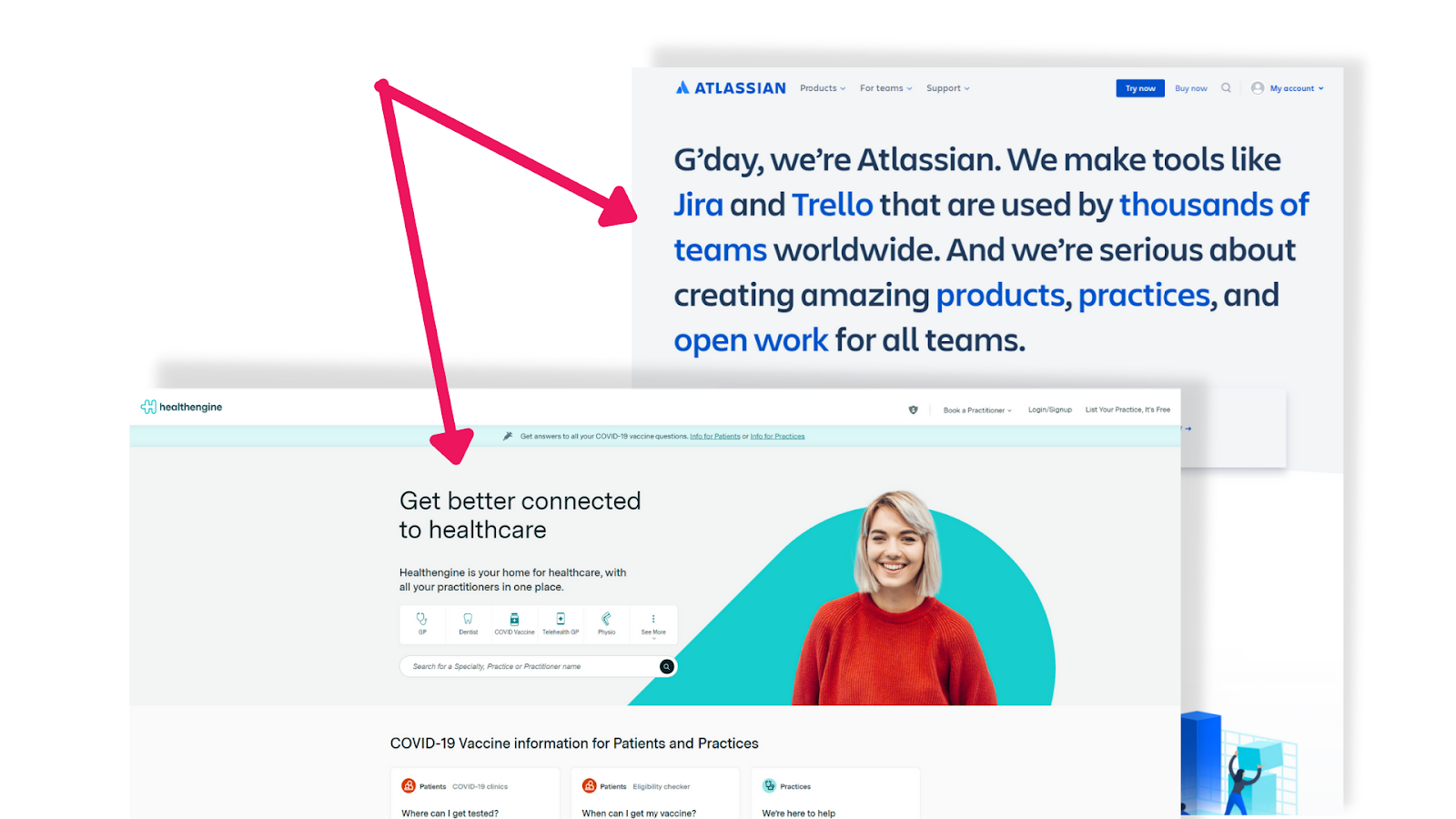
Sydney-founded Atlassian is a software company that makes business collaboration and productivity tools. They’ve been around longer than most high school kids (16 years and counting!) Atlassian’s solutions are used by over 40,000 customers all around the world.
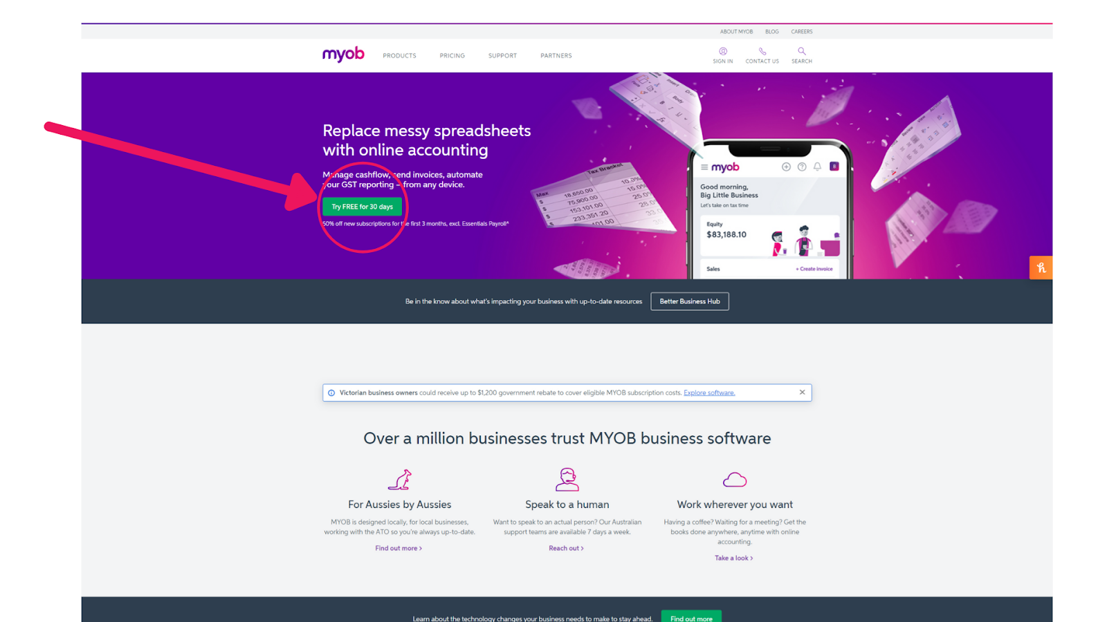
MYOB is an accounting tool and one of the oldest SaaS companies in Australia. It was founded in 1991 and is based in Glen Waverley, Australia.
Perth-based HealthEngine was founded in 2006 and is an Australian platform for healthcare access, making it easier for people to book medical specialists. Over a million Australians use the platform every month.
Visit any of these SaaS companies’ websites, and you will know precisely what they do – and what they want you to do – within the first few lines of reading.


Notice it?
Their entire website design is built with the goal to draw attention to the CTA and have users click on it.
Clarity is a critical part of web design. When you combine crisp, clear copy and a clean design, users are more likely to know what you do and what they need to do next.
A study performed by HBR (a high-brow publication based in the US) found that by shortening the length of a menu to make it more user friendly, on average websites saw a 10% increase in engagement from visitors. No surprise then, that all 3 of these SaaS websites have short navigation menus.

A lot of websites have long, cluttered menus that are not easily accessible or aesthetically pleasing and lack functionality. All of these websites use more content on their landing page to reduce the need for huge menus, keeping readers engaged and making the info easily available in one place, without clicking away or going on a wild goose chase for content.
These SaaS giants know that increasingly popular good website design starts with important elements such as functionality, is well written, is user friendly, has an aesthetically pleasing color palette and focuses on the most important elements for conversion optimization.
In these 3 SaaS website design examples, colour is used sparingly but effectively to convey the brand, draw attention and keep visitors engaged. The colours are also pleasing on the eye and web friendly.
Colour is not restricted to brand awareness; it can often serve as a powerful catalyst for driving an emotional response.
By using comfortable colors in your design, you can help users feel at ease when consuming your content, which in turn helps them become more engaged with what you have to offer.
In these SaaS examples, we see a lot of blue and turquoise; both known to elicit different moods. Blue is seen as the color of tranquility and serenity. Turquoise, on the other hand, is thought of as a more calming and relaxing color with a different type of energy.
Even their use of white space is calculated and taken into account for the overall website design layout.
Seems that calm visitors are the goal here, across all websites.
I think it’s fair to say, the mobile experience is critical to any web design these days. And these SaaS companies make sure the mobile experience is seamless and stress-free when conducting their visual hierarchy exercise in the website design .

Often, we design for mobile first, as we know most visitors will be on their mobile devices and screen size matters. Designing for mobile first also makes it easier to design complex experiences that can then scale up to a desktop experience. Designing for mobile first also forces you to focus on a single device rather than a range of devices.
Designing for mobile is different from designing for desktop. The size of the screen is smaller and the user can’t interact with your website in the same way.
For example, people “tap” and don’t “click”. They “swipe” and don’t “scroll.” And on mobile, buttons and text can’t change colour when they hover the mouse over it, as there’s no mouse on a mobile.
These are just some of the things designers have to consider when building a mobile-friendly website.
However, there are three fundamental rules we follow when designing for mobile:
Many studies have shown that website design that uses a large font size and a clean and clear typography often provide a better user experience.
This is because large fonts and the right typography can improve readability, make it easier for users to interact with the content and can also create a stronger brand affinity.
When used correctly, big fonts and the right typography can help:
Again, no surprise to see these top 3 SaaS websites using big fonts and on-brand typography to their advantage too.

Visuals are incredibly powerful in creating powerful web design, as the human eye is naturally drawn to colours, faces, animations and anything else that contrasts the written text.
The challenge with imagery is balance. There are many different types of imagery that can be used on websites these days including photos, illustrations, infographics etc. Often, this leads to cluttering and information overload, not to mention a slower loading website and strain on visitors eyes.
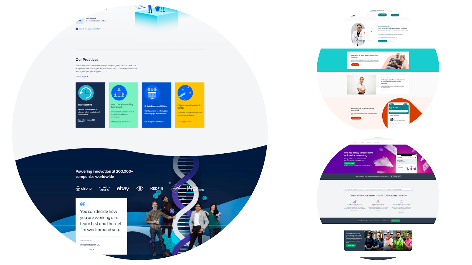
As with all website design, clear and simple rules the day, and these 3 SaaS websites are using imagery sparingly to break up text, draw attention to key features or points, while pairing back relentlessly to keep the page clean, quick to load and an overall enjoyable experience.

In a world of short attention spans and seemingly infinite choices, website design plays a major role in keeping people on your site, or sending them to the back button.
In these 3 SaaS website examples, you can clearly see some consistent web design rules at play:
Perhaps none of these things come as a surprise to you, or maybe they do, but in either case, it’s always a smart idea to keep these things in mind when designing a website for your SaaS, or any other type of business.
A good web designer should know these principles, but it’s even better when you know what good website design actually means; so you can engage a designer who’s on the same page.

We are the only Australian SEO agency you will ever need!

We are the only Australian
SEO agency you will ever need!